Posts

Actual full magazine

https://www.canva.com/design/DAEbraD27Kw/tMFU4N6_QXbCDdiPGI3qGg/edit https://www.canva.com/design/DAEc6MV98qM/88UnOjU1cpeU7DSWPRC0bQ/view?utm_content=DAEc6MV98qM&utm_campaign=designshare&utm_medium=link&utm_source=publishsharelink

Creative Reflection

  https://www.canva.com/design/DAEbraD27Kw/DY84AXNbV3H5zFizktgtnA/view?utm_content=DAEbraD27Kw&utm_campaign=designshare&utm_medium=link&utm_source=recording_view   The video here is the same as in the link  1.  How does your product use or challenge conventions and how does it represent social groups or issues? My product challenges conventions because many people expect magazines to talk about the normal issues that are happening currently at the moment but they do not expect people to talk about the problems that have been brought out through years or that are less important in other people's eyes. It represents issues of the world the issue that I made my magazine about was sexism and how it affects us and how it has been affecting us since before. 2. How do es your product engage with audiences and how would it be distributed as a real media text? The product would engage with audiences all over with females it would show them how this is an everyday thing but we ca

First Draft Magazine Cover

Image
 Making this magazine cover was a bit of a struggle because the colors kept on fighting with the background to be seen with the text I tried every color and I tried putting something behind the letters so it could make the letters pop out and be seen but it was just not working with me I moved the text box everywhere around the magazine to see if it could look better and I ended up just switching the two text boxes. I felt like if I left the magazine cover alone without text boxes that it was going to look very plain and boring and most of the magazines that I know of and that have been seen mostly have text boxes some of them even have the whole magazine covered in text boxes. I decided that I was going to do two front page covers to see which one comes out better that was the first one that I just described. For the second one that I designed I decided to use a different picture and instead of having the standard idea that was in my head like for the first one I just decided to let g

Idea Pitch

Image
  Why did you select this idea for your magazine? What are some similar references you've used that helped you influence your layout and design? Include images of those references. I wanted to chose a topic that I could talk about and that I was not going to lose interest in. A topic that I was passionate to either argue about or inform people about. A topic that made me feel like that was sexism, because I feel like sexism is a issue that not many people pay attention to. I used some layout styles that caught my attention and I also already had an idea of how I wanted to design the magazine in my head. This was one of the layouts that I decided to use as my source of inspiration I really liked how on most of the pages it has small pictures on the corners so it would not look like a lot of writing.

Feedback For First Magazine Sketch

Image
 How did you respond to the feedback from your initial proposal? What will you changed in your second round of sketches that are due soon?  For my feedback I was told that I should change my title and not be too literal with it. I was also told to be careful with the amount of words because if I add to much words it would look more like an essay instead of a magazine. For my second round of sketches I will be changing the title I could look for a synonym for sexism and I will add columns and reduce the amount of words to make the magazine look more clear. I was also told to suggest some white space for the second page and to think about some additional design elements that I could add.

Magazine Blog start

Image
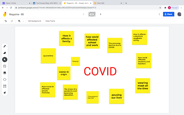
 I am not sure yet of what I want to write about in my magazine or how I want to lay it out, but the magazine audit helped me out a lot in identifying what a magazine has to have and what catches the audiences attention I learned new words of the magazine world like buzzword, puff, masthead, anchorage text, superimposition and unique selling point. I realized that they all have a huge cover line promoting the brand that the magazine is for. I also realized a lot of other things that I will be using in my magazine once I figure out what I would like to write about. Today we brainstormed some ideas on certain topics and it opened up my mind more to some ideas before I was blocked but the brainstorming really helped. There was a theme on each bored and we just had to write whatever came to our minds about that specific theme.

Five Basic Principles

Image
  These five basic principles elevate design because they make the designs and magazines easier to read and it's all organized for example proximity makes sure that each section is all about the same thing if the section is talking about cars then every thing in the section needs to some how relate  about cars. Another way it keeps everything organized is with alignment everything is arranged and it is not all over the place and messy. It is all in one place either in the left, right, middle, top and or bottom. The other principle that helps out with alignment is white space. White space technically is the space between the words and the lines it " gives the margin room to breathe". I will use these principles in my magazine because they give the magazine a high level of organization. I also like the principle proximity I really like how it categorizes each topic so I will be using that when I do my sketch and I will use the alignment so my work with the pictures I insert